A U-shape that appears as a linear correlation when averaged
The problem
While analysing the data from our U-shape experiments (see pre-registration for context: https://osf.io/kcr2q), we ran into a peculiar problem. As expected, we did find that memory performance can be described as a U-shape function of how expected a certain object is in certain location. However, we also predicted that the memory advantage for highly incongruent item/locations pairings as well as for highly congruent pairings are driven by different processes. More specifically, we predicted that recollection is driving the incongruency advantage, while familiarity is contributing to the congruency advantage. In other words, we predicted linear negative as well as linear positive relationships respectively.
We actually did find a linear negative relationship when averaging across subjects yielding one data point per item/location pairing.
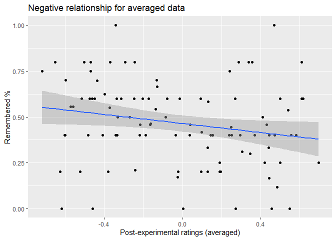
In this case, we have a significant negative correlation, r= -.211, p= .035. We get similar a relationship when we use the normative data that we collected from 6 participants who viewed all 400 possible pairings but did not perform a memory task, which is not very surprising as the correlation between the averaged post-experimental ratings and those normative ratings are very high, r= .864, p< .001.
However, if we examine the raw (not averaged) data find a U-shape instead of a linear relationship, which for instance can be seen in this visualisation of the marginal effects of a corresponding mixed linear model.
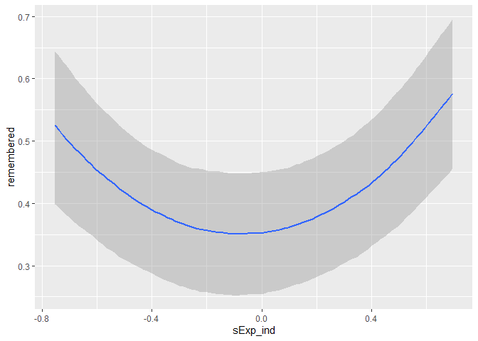
This confused us a lot. To investigate what is going one we have plotted individual loess smoothing lines because we thought maybe we are observing something like the Simpson’s paradox. Due to the fact that per participants there are only 20 data points those lines are very noisy and difficult to interpret.
On the quest to understand this discrepancy, I have noticed that there seems to be asymmetric spread. For instance, when we look up the normative ratings for any pairing that received the lowest expectancy rating possible (-100) and colour those to show the spread,
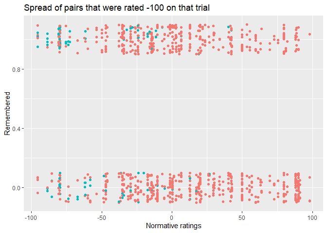
we see that there is less (rightward) spread than when we do the same thing for any pairing that received the highest expectancy rating (100).
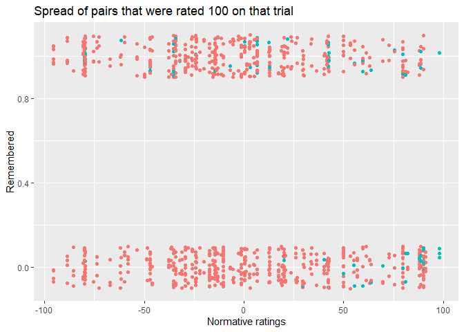
While the mean spread from -100 toward the right is 50.59, the spread from 100 towards the left is 73.97, which are significantly different, p = .001. This raises the possibility that averaging introduces and artefact because of this asymmetry, which why we see this discrepancy.
Simulation to reproduce this problem
To investigate whether an explanation like this can account for our discrepancy, we simulated data. This simulation is based on the idea to have an average expectancy per object. The expectancy for a particular participants is generated by taking this average expectancy as the mean of a normal distribution, while using a standard deviation (SD) that becomes smaller/larger as a function of expectancy.
|
|
Similar to our existing data, we have twenty pairings (i.e. objects) per participants (n = 75). We start with generating 20 random values between -100 and 100 for our objects.
|
|
In order to have an asymmetric spread, we have to scale the standard deviation (SD) as function of expectancy.
|
|
In the next step we generate expectancy ratings for each participant.
|
|
This process will create values that exceed the range of possible vaues, therefore everything is capped at -100 and 100.
|
|
To make it easier to compare the results with our analyse we scale the data to have mean of 0 and SD of 1.
|
|
In the last step, we use those expectancy values to create remember judgements as a quadratic logistic model.
|
|
This leads to this result:
|
|
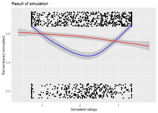
This shows that true quadratic relationship (blue loess line) can appear as straight line (red loess line) when averaged. Playing around with parameters of the regression and the SD scale allows one to easily create examples where the line is slightly negative.
|
|
In this case the correlation is r = -.732, p < .001.
|
|
If we now calculate the same rightward and leftward shift, we also get a significant difference, p < .001.
Conclusion
It is possible to explain the discrepancy in our data with this asymmetry. This can be shown with this simulation. The only caveat that remains is that the empirical relationship between the the averaged post-experimental ratings and their SD
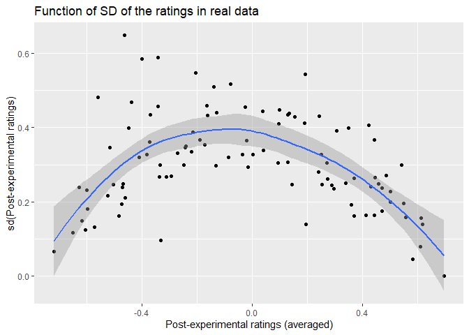
is different from the simulated ones as can be seen below.
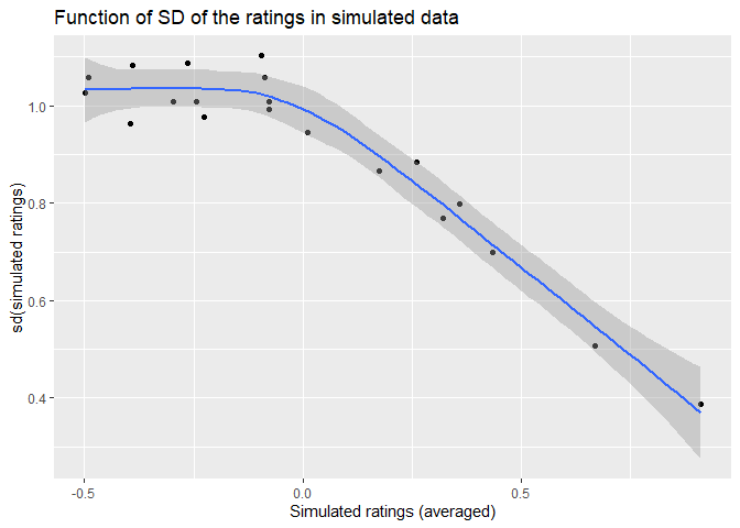
However, we believe this is just a matter of findings the right parameters and is not as important.